A more considered service website
The live page connects the first impression to service information, questions, and an assessment-request preview.
Demonstration build · Service Discovery
A roofing website concept with architectural imagery, plain service information, and a working estimate-request preview. The live build shows the experience—not a ranking or lead-generation result.
Business context
A roofing website needs to make an unfamiliar service easier to understand. The earlier demonstration relied on crowded promotional content and unsupported trust claims. This refresh puts the roof, the scope, and the next conversation first.
Lone Star Roofing is a fictional brand. The images are design references, not a verified contractor portfolio, and the form does not request real roofing work.
Design + implementation
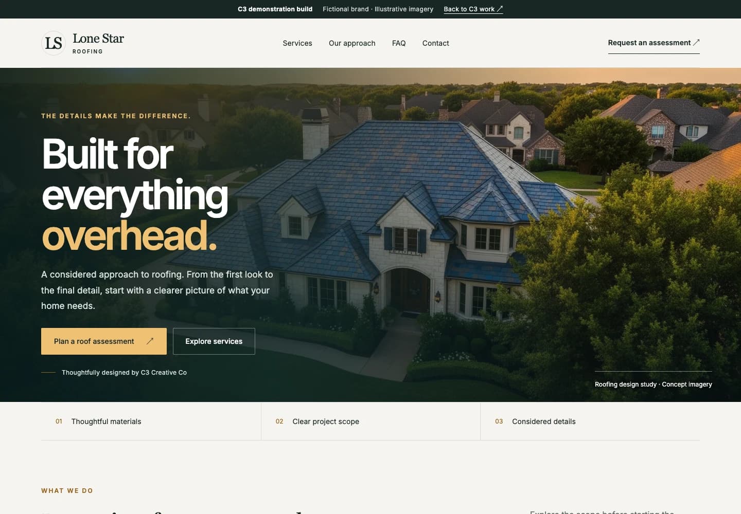
A wide architectural image, bold typography, and a restrained green-and-gold palette give the first screen a clear focal point. Service discovery and the assessment preview are the two next steps.
The page organizes roofing categories into readable descriptions, followed by the approach and common questions. Visitors can explore the scope without navigating a wall of repeated sales prompts.
Labeled fields, required-field validation, service selection, and a resettable confirmation demonstrate the request interaction. The confirmation states that nothing has been sent or booked.
The site is deliberately marked noindex. It demonstrates content organization and interface design; it is not evidence of local rankings, Google Business Profile work, contractor credentials, or completed roofing projects.
What the build demonstrates
The live page connects the first impression to service information, questions, and an assessment-request preview.
Visitors can open the menu, choose a section, or dismiss it with the keyboard. The layout was checked at phone, tablet, and desktop widths.
The form can be tried without transmitting personal information or creating a false expectation of contractor follow-up.
A qualitative comparison
These are implementation comparisons, not measured before-and-after client results.
Typical starting point: A crowded promotional hero with competing claims.
In this build: A single architectural focal point with readable copy and a clear assessment path.
Typical starting point: A mobile navigation control without a complete working menu.
In this build: An operable responsive menu with visible destinations and Escape-key dismissal.
Typical starting point: Unverified ratings and promotional trust claims.
In this build: Clearly identified concept imagery and an inspectable implementation.
A little more detail
No. The demo is intentionally not indexed. It shows website organization and interaction, not rankings, traffic, or leads.
No. They are illustrative images in a fictional website concept. C3 designed and built the website, not the pictured roofs.
No. The form is a local preview only. Use sample information; no contractor receives it.
Keep exploring

The next move
Tell us where the business needs to go. We’ll help work out what to build next.